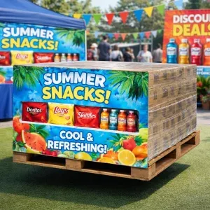
In crowded commercial environments, visual materials often act as the first point of contact between a brand and its audience. When displays are designed to replicate real people or objects at scale, colour accuracy becomes critical. Subtle variations in tone, saturation and contrast can influence how trustworthy, premium or professional a display feels. Whether placed in a retail space, exhibition hall or reception area, the way colour is handled shapes perception before a single word is read.
Accurate colour reproduction is not simply a design preference; it is a technical standard that affects realism. Human eyes are highly sensitive to colour inconsistency, particularly in skin tones, branded palettes and familiar materials. When colours appear washed out or overly vivid, the display immediately feels artificial. This can undermine the purpose of using life-size visuals, which is often to create presence, familiarity and engagement at close range.
Colour psychology is amplified when visuals are presented at human height. At this scale, viewers instinctively compare the display to real-world references. Skin tones that lean too warm can appear unhealthy, while cool shifts may suggest poor lighting or low production quality. For branded displays, even minor deviations from established colours can weaken recognition and trust.
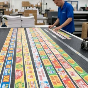
High-quality printing processes manage colour consistency across large surface areas. This is particularly important when gradients, shadows or photographic detail are involved. Uniform colour application prevents patchiness and banding, both of which are common issues in lower-grade production. When handled correctly, colour supports realism rather than distracting from it.
The surface material used for life-size displays plays a significant role in colour accuracy. Cardboard density, coating and finish all affect how ink is absorbed and reflected. A smooth, well-coated board allows for sharper detail and more accurate colour reproduction, while cheaper substrates can dull vibrancy and reduce contrast.
When producing a full size cardboard cutout, these material decisions directly impact the final result. High-grade boards maintain colour stability under varied lighting conditions, including strong indoor lighting or indirect daylight. This ensures the display looks consistent throughout the day, rather than shifting in tone as conditions change.
Colour quality cannot be assessed in isolation from lighting. Displays positioned near windows, under spotlights or in large open spaces will be exposed to fluctuating light sources. Poorly balanced colour profiles may look acceptable in controlled environments but fail under real conditions.
Professional production accounts for this by calibrating colours to remain balanced across different lighting temperatures. Neutral whites, controlled saturation and accurate contrast prevent displays from appearing flat or overly harsh. This level of consideration is essential when displays are intended for long-term use in public-facing environments.
Life-size displays often represent real people or brand figures, so accurate colour is essential for credibility. Clothing, logos and facial details must appear natural and consistent. In commercial spaces, poor print quality can weaken brand authority, which is why organisations prioritise higher production standards.
For example, established construction companies cardiff delivering residential builds, commercial projects, refurbishments and ongoing property maintenance often use large-format visuals in showrooms, site offices and promotional spaces. These businesses rely on strong visual cues to convey reliability and professionalism. Colour-accurate displays help reinforce that message, aligning physical materials with the standards expected in the built environment.
When multiple life-size displays are used together, colour consistency becomes even more important. Variations between units can be immediately noticeable, creating a disjointed appearance. This is particularly relevant for campaigns rolled out across multiple locations.
Using controlled colour profiles and consistent materials ensures uniformity. When producing a full size cardboard cutout as part of a wider set, matching tones across all pieces maintains cohesion. This level of consistency supports brand recognition and avoids the impression of fragmented production.
Colour quality is not only about initial appearance but also about how well it lasts. Displays exposed to light, air and handling can fade over time if low-quality inks are used. Fading alters colour balance, often leaving prints looking tired and unprofessional.
High-quality inks and protective finishes extend colour life. This is particularly important for displays intended for repeated use or long-term placement. A well-produced display retains its impact, reducing the need for frequent replacement and maintaining visual standards over time.
Audiences subconsciously associate colour quality with value. Crisp, accurate colours suggest attention to detail and investment, while dull or inconsistent tones imply compromise. At a life-size scale, these cues are magnified.
In sectors where trust and reputation are essential, such as construction, facilities management and property development, visual presentation supports credibility. When companies commission displays that reflect their standards, they reinforce their positioning without overt messaging. Colour accuracy becomes part of the communication.
Achieving consistent colour at scale requires expertise. From calibrated equipment to controlled workflows, professional production environments reduce variability. Quality control checks ensure that what is approved in proofing is what appears in the final product.
When producing a full size cardboard cutout, experienced providers manage every stage, from file preparation to finishing. This reduces the risk of unexpected colour shifts and ensures the display performs as intended in real-world conditions.
Print resolution, file preparation and colour profiles must align precisely, because enlarged artwork magnifies flaws, while disciplined workflows protect detail, tonal balance and edge clarity across every square centimetre during production stages.
Choosing life-size displays is not simply about size or imagery. Colour quality plays a decisive role in how those displays are perceived, trusted and remembered. Accurate, durable colour enhances realism, supports branding and communicates professionalism. By prioritising colour quality, organisations ensure their displays deliver lasting impact and reflect the standards they wish to project.
© 2026 Point of Sale Printers. All Rights Reserved.